Brand Assets
The anoni.net logo is three hexagons, evoking a network of nodes and layered observation, derived and coloured from the Material hexagon-multiple-outline icon. The three hexagons sit top, middle, and bottom, corresponding to the three reading layers the community works across: concepts, tools, and regional context.
When making event materials, social cards, slides, or print, take one of the three variants below according to your background colour and situation, rather than recolouring or reshaping the mark.
V3 cyan tonal (primary)
The three hexagons in cyan-300, cyan-500, and cyan-700, giving the nodes depth. Default use: white and light backgrounds, general documentation, slide interiors.
White
 643216
Dark
643216cyan-500
643216cyan-900
643216V3 mono white (on brand colour)
Pure white, for the highest contrast on brand colours (cyan-500, cyan-900) and dark blocks. The site header logo uses it against the blue navigation bar, as do OG images, social cards, and event banners on cyan.
White (not recommended)
 643216
Dark
643216cyan-500
643216cyan-900
643216V3 mono black (print and single-colour)
Pure black, for print, fax, and single-colour stencils where colour is unavailable. It is rarely used online and is kept here for completeness.
White
 643216
Dark (not recommended)
643216cyan-500 (not recommended)
643216cyan-900 (not recommended)
643216Wordmark (the logo with the name)
The three variants above are the mark on its own, without the community name. Where the name needs to be read at a glance, use a wordmark instead: slide headers, business cards, event backdrops, posters, roll-up banners. Keep the icon-only versions for places that are either very small or already carry the name nearby, such as favicons, chat avatars, and slide corners.
The lettering is converted to paths, so it renders identically whether or not the device has the fonts installed, and no character can silently fall back to a different typeface. The Chinese subtitle is fixed as 匿名網路社群 in Traditional Chinese, matching the site name shared across all three editions.
Six layouts
| Filename | Layout | Where to use it |
|---|---|---|
logo-wordmark-* |
Horizontal, logo plus anoni.net | The default. Slide headers, site header, business cards |
logo-wordmark-zh-* |
Horizontal with the Chinese subtitle 匿名網路社群 | Chinese-language settings, where the Chinese name should be visible |
logo-wordmark-en-* |
Horizontal with the English subtitle Anonymity Network Community | International settings such as Global Gathering or ETHTaipei |
logo-wordmark-fullname-* |
Single line, 匿名網路社群 anoni.net | Long banners and backdrop headers in Chinese-language settings |
logo-wordmark-stack-* |
Stacked, logo above the name | Posters, roll-up banners, exhibition boards |
logo-wordmark-stack-zh-* |
Stacked with the Chinese subtitle | As above, in Chinese-language settings |
Each layout comes in tonal, white, and black, following the same selection rules as the icon-only variants above.
The four horizontal layouts, cyan tonal on white
logo-wordmark

logo-wordmark-zh

logo-wordmark-en

logo-wordmark-fullname

The same four in mono white, on cyan-900
logo-wordmark-white

logo-wordmark-zh-white

logo-wordmark-en-white

logo-wordmark-fullname-white

Stacked, for posters and roll-up banners
logo-wordmark-stack

logo-wordmark-stack-zh

stack-zh mono white

stack mono white

Proportions and clear space
The proportions are fixed. To change the size, scale the whole lockup; do not adjust one part on its own.
- Horizontal: the logo height is 1.35 times the visual height of the anoni.net lettering, and the gap between them is 0.40 times the logo width
- Stacked: the logo height is 1.90 times the type size, with the lettering centred under the mark
- Clear space: 0.25 times the logo height on all four sides. The SVG viewBox already includes it, so do not crop inwards when placing the file
The lettering is Public Sans SemiBold and the Chinese subtitle is Noto Sans TC Medium, the same faces as the body text on the English and Traditional Chinese editions. In the tonal variant, .net uses cyan-700, matching the lowest hexagon; the mono variants are a single colour throughout.
Minimum size
Below these heights the lettering blurs, so switch to the icon-only mark.
| Layout | Minimum height |
|---|---|
No subtitle (logo-wordmark-*, logo-wordmark-fullname-*) |
18 px |
Chinese subtitle (-zh-) |
32 px |
English subtitle (-en-) |
40 px |
In print terms, 18 px at 300 dpi is roughly 1.5 mm; in practice the horizontal version is safe at 8 mm high and above.
Downloads
| Layout | cyan tonal | mono white | mono black |
|---|---|---|---|
| Horizontal | SVG | SVG | SVG |
| Horizontal, Chinese subtitle | SVG | SVG | SVG |
| Horizontal, English subtitle | SVG | SVG | SVG |
| Single line, full name | SVG | SVG | SVG |
| Stacked | SVG | SVG | SVG |
| Stacked, Chinese subtitle | SVG | SVG | SVG |



Colour tokens
Align derivative work to these values. The site's extra.css already defines them as CSS variables, so use var(--brand-cyan-500) rather than an inline hex code.
Brand cyan, nine steps
| Token | Hex | Use |
|---|---|---|
--brand-cyan-50 |
#e0f4ff |
Lightest background, card fill, admonition fill |
--brand-cyan-100 |
#b3e3ff |
Light background, selection state |
--brand-cyan-200 |
#80d1ff |
Dividers, borders, disabled text |
--brand-cyan-300 |
#4dbfff |
Secondary links, tag borders, top logo hexagon |
--brand-cyan-400 |
#26b3ff |
Hover state |
--brand-cyan-500 |
#00aeff |
Brand base, middle logo hexagon |
--brand-cyan-600 |
#009ee6 |
Primary hover and active, "new" announcement tag |
--brand-cyan-700 |
#0089bf |
Primary text on light backgrounds, bottom logo hexagon |
--brand-cyan-800 |
#006d99 |
Emphasis text, dark variants |
--brand-cyan-900 |
#003e57 |
Dark mode background contrast |
Accent, for calls to action and emergencies
| Token | Hex | Use |
|---|---|---|
--accent-action |
#ef6c00 |
Call-to-action buttons, event announcements |
--accent-emergency |
#d32f2f |
Emergency help, security warnings |
Structural secondaries, for the three 2026 tracks (category tags only)
| Token | Hex | Use |
|---|---|---|
--cat-privacy |
#4caf50 |
Personal privacy guide |
--cat-relay |
#7b1fa2 |
Tor relays on campus |
--cat-payments |
#ef6c00 |
Anonymous payments, sharing the accent action colour |
Neutrals
| Token | Hex | Use |
|---|---|---|
--neutral-text |
Material default | Body text |
--neutral-muted |
#546e7a |
Secondary text, background roles |
--neutral-border |
#cdcdcd |
Image and card borders |
Diagram colours
The hand-written SVGs in docs/diagrams/ are standalone files pulled in by an img tag, so they cannot reach the page's CSS variables. The set below is therefore not written as var(--x); copy the hex values straight into the SVG's <style>. Copy the class names too, because the thirty-odd diagrams already share one set and the next person to edit one should not have to learn a second.
Semantic colours, each cell giving a fill and a border:
| class | Where it goes | Light fill | Light border | Dark fill | Dark border |
|---|---|---|---|---|---|
.card-c1 |
The highlighted row, the main path | #e0f4ff |
#4dbfff |
#0d2b38 |
#4dbfff |
.card-ok |
Works, low cost, low risk | #e8f5e9 |
#4caf50 |
#17301a |
#4caf50 |
.card-w1 |
Conditional, needs care, medium | #fdf0e4 |
#f8b878 |
#2b1f16 |
#8a5420 |
.card-no |
Does not work, high cost, high risk | #fdecea |
#d32f2f |
#35181a |
#e57373 |
.card |
A plain card with no verdict attached | #ffffff |
#cfd8dc |
#23292e |
#4b565e |
.card-n |
Downplayed, secondary, ruled out | #f4f6f7 |
#b0bec5 |
#1c2226 |
#46515a |
The three-step cyan ramp for layered diagrams, lightest to darkest running bottom to top or outside to inside:
| class | Level | Light fill | Light border | Dark fill | Dark border |
|---|---|---|---|---|---|
.card-c1 |
Lightest, first layer | #e0f4ff |
#4dbfff |
#0d2b38 |
#4dbfff |
.card-c2 |
Middle layer | #b3e3ff |
#26b3ff |
#10394b |
#26b3ff |
.card-c3 |
Darkest, top layer | #80d1ff |
#0089bf |
#14495f |
#4dbfff |
An orange ramp for warning levels or rising cost, built the same way as the cyan one:
| class | Level | Light fill | Light border | Dark fill | Dark border |
|---|---|---|---|---|---|
.card-w1 |
Lightest | #fdf0e4 |
#f8b878 |
#2b1f16 |
#8a5420 |
.card-w2 |
Middle layer | #f8b878 |
#ef6c00 |
#7d4b19 |
#ff8c1a |
.card-w3 |
Darkest, saturated fill | #ef6c00 |
#c85a00 |
#ff8c1a |
#ffa64d |
The darker the fill, the fewer text colours it will take:
| Card | Light | Dark |
|---|---|---|
.card, .card-n, .card-c1, .card-w1, .card-ok, .card-no |
.t-main or .t-mute |
Same |
.card-c2, .card-c3, .card-w2 |
.t-main only |
.t-main only |
.card-w3 |
.t-onfill #212121 |
.t-onfill #241708 |
.t-mute at #546e7a scores 3.95:1 on .card-c2, 3.21:1 on .card-c3 and 3.12:1 on .card-w2, all under AA, so those three fills take .t-main only, which scores 9.3 to 11.8:1.
.card-w3 has to go opposite ways in the two modes. On the light fill #ef6c00, white text scores 3.08:1 while #212121 scores 5.23:1. On the dark fill #ff8c1a, #eceff1 scores 2.02:1 while #241708 scores 7.51:1. The older .t-inv paired white in light mode with #241708 in dark, so the light half fell short. The vertical rework on 2026-09-19 replaced every instance with .t-onfill, and none remain across the 77 hand-written files.
.t-onfill holds the same value as .t-main in light mode, #212121, and only diverges to #241708 in dark mode. The two classes cannot be merged: merging them drops .card-w3 to 2.02:1 in dark mode.
Text and lines:
| class | Where it goes | Light | Dark |
|---|---|---|---|
.t-main |
Primary text | #212121 |
#eceff1 |
.t-mute |
Secondary text and notes | #546e7a |
#b0bec5 |
.t-onfill |
Text on a saturated fill, see the pairing table above | #ffffff |
#241708 |
.rule |
Divider | #cfd8dc |
#46515a |
.arrow |
Flow arrow | #90a4ae |
#6b7780 |
Do not nest a tag inside a card of the same role. A .card-w1 tag sitting on a .card-w1 card shares its fill, leaving only the border to separate them; switch the role or drop the outer card to .card-n.
Colour must never be the only thing carrying the meaning. The text inside each block has to say it in full, so a tag reads "Anonymity High" rather than relying on the green. Red against green is the hardest pair for colour-blind readers, and once the words are complete the colour is only reinforcement, so a reader who cannot tell the two apart still gets the content.
Measured contrast puts every text pairing above the WCAG AA threshold of 4.5:1. #212121 scores 14.1 to 16.1 on the six light fills, #eceff1 scores 12.3 to 14.0 on the six dark fills, #546e7a scores 5.4 on white, 5.0 on the neutral card and 4.8 on the cyan card, and #b0bec5 scores 7.7 to 8.4 on the dark cards.
.t-mute is #546e7a, which is also --neutral-muted in the neutral set above. The older #607d8b reached only 4.37:1 on white, just under AA. The vertical rework on 2026-09-19 replaced every instance, and none remain across the 77 hand-written files.
Border colours land between 1.5 and 2.8:1 against the page background, short of the 3:1 in WCAG 1.4.11. The judgement here is that the border reinforces and the words inside carry the meaning, so the threshold is not enforced. It does not extend to diagrams where colour genuinely does the distinguishing, such as scatter plots and bar charts; label every data point in those.
Logo fills
| Colour | Hex | Use |
|---|---|---|
| White | #ffffff |
mono white fill, on brand-colour blocks only |
| Black | #000000 |
mono black fill, print only |
Using the colours
Brand cyan
- Brand-consistent surfaces: hero areas, alongside the logo, primary call-to-action borders
- Primary links and navigation highlights
Accent action (orange #ef6c00)
- Buttons where the reader takes an action: register, subscribe, join
- Event announcements
Accent emergency (red #d32f2f)
- The entry point to the emergency help page
- Security warnings such as account compromise and stalking response
- Not for "click this button" in non-urgent contexts
Structural secondaries (green, purple, orange)
- Card icon colours for the three tracks
- Category tags and section markers
- Not for general calls to action or decoration
Announcement tags (inline tags on the home page and blog announcements)
Newuses--brand-cyan-600Eventuses--accent-actionUpdateduses--cat-privacy, sharing a colour with the privacy track, where the weak visual association is acceptable
Social cards (Open Graph)
Paste any page of the docs into Mastodon, LinkedIn, X, Bluesky or a chat room, and the preview image comes straight from the build. One card per page per language, no manual artwork.
The card uses the palette from this page. cyan-900 is the background, and a three-part bar runs down the left edge in cyan-300, cyan-500 and cyan-700, matching the three hexagons of the logo. The mono white logo and the site name sit at the top left, the page title in the middle, and the page description and URL below it. When a page sets icon in its front matter, that icon is enlarged into a 10% white watermark on the right. Pages without one get material/hexagon-multiple-outline, the icon the logo was derived from.
The background is cyan-900 rather than the brand colour cyan-500, so that the text stays readable. White on cyan-500 has a contrast ratio of 2.5:1, which turns to mush at the size social platforms display. On cyan-900 it is 11.5:1. The description uses cyan-100 at 8.4:1, and the footer URL cyan-300 at 5.6:1.
The layout lives in docs/layouts/anoni.yml, shared by all three languages. The only per-language differences are the font (Noto Sans TC, Noto Sans SC, Public Sans) and the site name printed on the card, set in mkdocs.yml, mkdocs_cn.yml and mkdocs_en.yml. Change the shared layout instead of forking it per language.
Line breaking for Chinese titles
The plugin that draws the cards breaks lines at whitespace only. A Chinese sentence has none, so it counts as a single word, and anything past the first line used to be cut off at the edge of the canvas without even an ellipsis. Before this change, the longest post title on the site showed only its first half.
The layout now adds a space after the full-width comma, enumeration comma, colon, full stop, exclamation mark and question mark, which gives the line breaker somewhere to break. A space that lands at the end of a line disappears. The cost is an occasional extra gap inside a sentence. In return, every title and description across the three languages now fits. Titles of 14 characters or fewer are left alone, as they fit on one line anyway.
Overriding a single page
To give one page a different title, description or background colour, override it in that page's front matter:
social:
  cards_layout_options:
    title: The title to print on the card
    description: The description to print on the card
    background_color: "#003e57"
A background image uses the same option. The path in background_image is relative to the directory mkdocs runs in, which is docs/, so write it as zh-TW/assets/images/xxx.png. A missing file fails the build. Give the image on its own and the background colour becomes an 80% cyan-900 scrim, which keeps white text readable over any image. For the raw image, add background_color: transparent, at the cost of losing the title and the footer URL on a light image.
Pages that need artwork of their own (event key visuals, the interactive section) take a different route: set og.enabled: true and og.image in the front matter, and the site template uses that image and skips the generated one. The COSCUP event pages and the interactive section work this way.
What not to do
Logo
- Do not place it on oversaturated fluorescent colours or multicolour gradients, which blur the hexagon edges
- Do not set it immediately adjacent to partner logos such as Tor, OONI, or EFF, where the marks compete
- Do not use mono white on white, or cyan tonal on cyan, where the contrast disappears
- Do not use mono black as a primary mark or on the web, since it is the print variant
- Do not adjust the hexagons' arrangement, spacing, or corner radius
- Do not extract a single hexagon for another purpose. The three are one mark
- Do not re-space or resize the logo and lettering inside a wordmark independently; scale the whole lockup
- Do not swap a wordmark's subtitle for an event name or other text. Lay that out separately and place the wordmark into it as one element
- Below the minimum size, drop to the version without a subtitle. A blurred subtitle reads worse than none
Colour
- Do not pick arbitrary Material defaults (brown, lime, indigo) for decoration
- Do not use multicolour gradients as backgrounds, outside a deliberate hero experiment
- Do not use oversaturated colours such as pure red
#ff0000or pure green#00ff00 - Do not write
style="color: #...;"inline. Use the CSS variable
Contributing technical diagrams
Technical diagrams (flowcharts, architecture diagrams, comparison matrices, timelines) come in two flavours:
- drawio, for diagrams with many nodes and connections, saved in the dual
.drawio.svgformat - Hand-written SVG, for diagrams on a regular grid such as matrices, layer stacks, and timelines. Writing one directly is faster than dragging boxes around a canvas, and the file is one to two orders of magnitude smaller
Both are SVG, rendered directly by browsers, mkdocs, and the IPFS and onion mirrors.
Diagram files live on assets.anoni.net
Diagram files do not go into docs/<lang>/assets/images/. The three language trees each have their own physical copy of assets/images/, so one diagram means three copies, and missing a language gives you a broken image on that page with no build error. That is exactly how seven drawio diagrams stayed broken in zh-CN for a while without anyone noticing.
| Thing | Where |
|---|---|
| Source file (version-controlled, reviewable, revertible) | docs/diagrams/ |
| Published copy | /srv/images-anoni-net/diagrams/ on m6 |
| URL referenced from articles | https://assets.anoni.net/diagrams/<filename> |
docs/diagrams/ sits outside docs_dir (which points at each language directory), so it is never built into the output. It is purely where the sources live.
Readers never connect to assets.anoni.net. The mkdocs-material privacy plugin downloads external assets at build time, and the img src in the output is a relative path under assets/external/assets.anoni.net/.... The onion build and the IPFS mirror stay self-contained, and no reader ends up making a request to the clearnet.
The cost is that assets.anoni.net has to be reachable at build time. When a download fails the privacy plugin still registers the file, copy_static_files then cannot find it, and the whole build fails. The plugin does not retry.
Filenames carry the language
A diagram containing Chinese or English prose needs one file per language, named <slug>.<lang>.svg:
anonymity-visibility-matrix.zh-TW.svganonymity-visibility-matrix.zh-CN.svganonymity-visibility-matrix.en.svg
A diagram carrying only English technical terms, or no text at all, is shared across all three languages and drops the language segment: <slug>.svg.
Where a diagram has not been translated yet, point the other two languages at the zh-TW file so at least something renders. A .zh-TW. file referenced from a zh-CN or en page is the marker for translation still owed.
Publishing
./tools/publish_diagrams.sh --dry-run   # validate SVG syntax only
./tools/publish_diagrams.sh             # validate, upload, check every URL returns 200
The order matters. Publish the image and confirm the URL returns 200 before editing the Markdown reference. Doing it the other way round breaks the next build.
Overwriting an existing filename also needs a Cloudflare purge, since the edge max-age is 12 hours. Set CF_ZONE_ID and CF_PURGE_TOKEN and the publish script handles it.
Skipping the purge before pushing docs is worse than briefly serving a stale file. The privacy plugin fetches from the edge at build time, so the stale version gets baked into the S3 output, and the site keeps serving it even after the edge cache expires, because the site reads the output rather than the origin.
Recovering from that is harder than it sounds. Purging the edge and rebuilding does not help: CI separately caches docs/.cache/plugin/privacy (see the comment in build_docs.yml), the URL already has a file sitting there, and the privacy plugin will not download it again. Fixing it through cache eviction means deleting every mkdocs-privacy-* entry on GitHub Actions, since restore-keys fall back and removing only the newest changes nothing, and the price is that the next build has to gamble on a dozen external hosts again.
So the rule is not to overwrite a filename. Give a meaningfully redrawn diagram a new name and update the Markdown reference along with it, and no layer along the path can hand back something old.
The full sequence was walked on 2026-08-28. The matrix diagram was recoloured and re-uploaded while the edge was still inside max-age, docs was pushed, and the site served the old version. Purging the edge and running workflow_dispatch still left the old version in place, because the CI privacy cache hit, the output was unchanged, and the upload step skipped it. Renaming the file from anonymity-vs-privacy-matrix to anonymity-visibility-matrix was what finally fixed it.
Saving so the XML is embedded
What separates a drawio.svg from a plain SVG is an extra content="..." attribute on the root <svg> tag, holding escaped drawio mxfile XML. drawio reads that to rebuild the structured editing experience. Without it, drawio sees a pile of independent paths, rectangles, and text, and re-editing is essentially impossible.
Two fields in drawio Desktop's save dialog matter:
| Field | Setting |
|---|---|
| Filename | xxx.drawio.svg, the conventional double extension |
| Format dropdown | Editable Vector Image (.drawio.svg) |
The format dropdown is what decides. A filename ending .drawio.svg saved with the format set to plain SVG produces a file that looks right and has no XML. This is the easiest mistake to make.
drawio Desktop usually defaults to .drawio, which is pure XML that browsers cannot display, so switch the format manually when creating a file, or change the default permanently in Preferences.
Do not use Export
drawio writes files two ways:
- File → Save: writes back to the original file and keeps the XML, provided the format is
.drawio.svg - File → Export As → SVG: produces a new plain SVG and strips the XML
Diagrams going into the repository use Save only. Export As is for handing a file to another tool, and the result does not go back into the site.
Verifying the XML is there
After saving:
grep -c mxfile your-diagram.drawio.svg
Expect 1 or more. A result of 0 means the file has no embedded XML and cannot be re-edited, so reopen it in drawio Desktop and save again with the correct format.
Keeping colours consistent
New diagrams use the brand cyan scale above. Pasting this into drawio Desktop under Extras → Configuration makes the brand colours the picker defaults:
{
  "presetColors": [
    "00aeff", "009ee6", "0089bf", "006d99", "003e57",
    "4dbfff", "26b3ff", "80d1ff", "b3e3ff", "e0f4ff",
    "ef6c00", "d32f2f", "4caf50", "7b1fa2", "546e7a", "cdcdcd"
  ],
  "defaultColors": [
    "00aeff", "009ee6", "ef6c00", "d32f2f",
    "4caf50", "7b1fa2", "546e7a", "ffffff"
  ]
}
Set once and stored permanently, so the picker offers brand colours rather than Material defaults.
Rules for hand-written SVG
A hand-written diagram is a standalone file pulled in by an img tag, so it cannot reach the page's CSS variables. Colours have to be literal hex values, copied from "Diagram colours" above along with the class names.
Size the canvas for phones
Draw on a 400-wide canvas and let the content run downwards. The page clamps the diagram into the content column with max-width: 100%, and that scale factor depends only on width, never on height — so a wider canvas is scaled harder, and phones sit at the worst end of the range. Measured content column widths across viewports:
| Viewport | Content column | Scale on a 940 canvas | Scale on a 400 canvas |
|---|---|---|---|
| 1920 | 855 | 0.91 | 1.20 |
| 1440, 1280 | 668 | 0.71 | 1.20 |
| 1024 | 750 | 0.80 | 1.20 |
| 768 | 736 | 0.78 | 1.20 |
| 414 | 382 | 0.41 | 0.96 |
| 390 | 358 | 0.38 | 0.90 |
| 360 | 328 | 0.35 | 0.82 |
Body text is 16 to 17.6px on desktop and 16px on phones. On a 940 canvas, 11.5px text renders at 8.2px on a 1440 screen and at 4.0px on a 360 phone, roughly a quarter of the body text beside it. A headless Chrome sweep of all 81 files in docs/diagrams/ on 2026-09-19 put the smallest text between 3.5 and 5.0px on a 360 phone, with no exceptions, and the site has no lightbox, so a reader can only pinch-zoom the whole page and pan around.
On a 400 canvas, 13px text renders at 15.6px on a 1440 screen, 11.6px on a 390 phone and 10.7px on a 360 phone. The desktop end is handled by .diagram-tall, which scales the image up to 480px. See "Using a diagram in a markdown article" below.
The relationship between canvas width and font size is:
canvas width <= phone content column × smallest font size in the diagram / target rendered size
To land the smallest text above 11px on a 360 phone (content column 328), 12.5px text caps the canvas at roughly 372 and 14px text at roughly 417.
Turn horizontal layouts vertical
Left-to-right flows become top-to-bottom flows, side-by-side columns become stacked cards, and horizontal timelines become vertical ones. When a comparison matrix cannot fit its column headers into 400 units, move each header into the cell it labels: four rating columns become a 2×2 set of tags inside the card.
Keep full sentences of prose out of the diagram. Those one or two footnote lines are a large part of what forces a wide canvas, and once baked into an image they cannot be selected or searched, and translating them means redrawing the whole file. Put them in the figcaption or in the article body.
Splitting a diagram into a phone file and a desktop file behind <picture> and srcset does not work here. The privacy plugin only rewrites img src, script src, a href and the image href inside an SVG. A srcset is left alone, so the onion and IPFS editions would keep a clearnet request to assets.anoni.net.
The layout reference
The diagram below uses every layout element and every colour token once. Copy from it when drawing a new one: the sizes, padding and colour values are all in there.
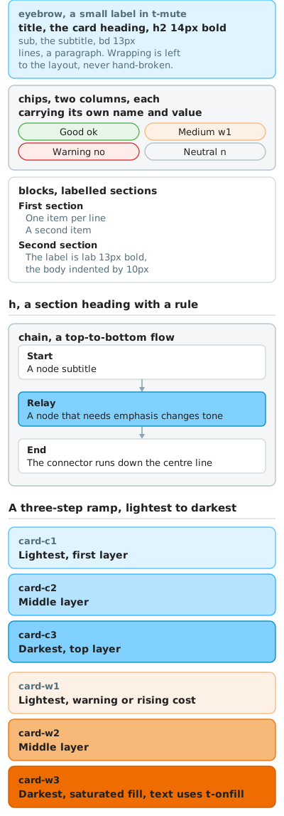
The fixed numbers: a 400-wide canvas, a 12 outer margin and 14 of card padding, which leaves 348 of usable text width. From the top of a card to its first line of text is 24px, and the line height is 17px.
Card spacing has three values, chosen by relationship:
| Gap | Where it goes |
|---|---|
| 8px | Colour-step variants of one family, such as the three cards of a ramp |
| 10px | The ordinary case, between two cards that mean different things |
| 14px | A section or family boundary, such as the cyan ramp giving way to the orange one |
Corner radius has three values, chosen by shape:
| rx | Where it goes |
|---|---|
| 8 | Cards |
| 6 | Flow nodes and small boxes inside a card |
| Half the height | Pill-shaped tags. A 24-high tag takes rx=12, not a hard-coded 6 |
Font sizes are only 15, 14 and 13. That hierarchy is built from two axes, weight and colour, rather than a rising size scale: 15 and 14 are bold and dark, and 13 appears both bold (section labels) and regular (body). To add another level of emphasis, change weight or colour rather than inserting 12.5 or 13.5, because within a 0.82 to 1.2 scaling range half a pixel is invisible.
The eyebrow is muted, and the alt is the only authoritative text
A card's eyebrow takes the same colour family as its subtitle (.t-mute on light fills, .t-main on .card-c2, .card-c3 and .card-w2, .t-onfill on .card-w3), leaving the title as the only dark line. The three lines then read as a quiet label, a loud title and a quiet subtitle. With both the eyebrow and the title in dark, only 1px of size separates them, and at 328 wide that looks like one title broken across two lines.
The eyebrow carries a category or a number ("Level 1", "Send", "Environment layer") and the title says what the card is about. If a string reads as the card's main information on its own, it belongs in the title rather than the eyebrow.
Keep a short <title> inside the SVG for anyone opening the file URL directly, and do not write a <desc>. The diagram is pulled in by an img tag, the browser treats it as an opaque bitmap, and the title, desc, role and aria-* inside the SVG never reach assistive technology: what a reader hears is the img alt. Write the full description once, in the alt. Keeping two copies only lets them drift apart.
Flows use a centred connector
Nodes in a top-to-bottom flow are full-width rounded rectangles with left-aligned text. Leave 18px between nodes and run a connector down the centre line of the canvas, drawn with .arrow (stroke #90a4ae, #6b7780 in dark mode, width 1.6) and ending in a solid .arrow-h triangle.
Do not use a text character such as "↓" as the arrow. Its baseline, weight and size follow the body text and it does not line up with the centre of the nodes, so it reads as a stray glyph rather than as a flow.
node       rect x=26 width=348 rx=6
connector  M200 y V y+12
arrowhead  M196 y+11 L204 y+11 L200 y+18 Z
Leave line breaks to the layout
When the English version runs out of room, let the diagram grow taller rather than wider. All three locales share one set of column coordinates and absorb the difference in length by wrapping. Keep one sentence per string in the source data and leave the line breaks to the layout, because hand-written breaks combined with wrapping produce orphan lines such as the or on in English, and in Chinese a line holding nothing but a full stop, or a full stop pushed to the start of a line. docs/diagrams/ currently carries 10 of these, spread across donation-channels, shutdown-levels and baseline-layers.
Measure the rendered font size in a headless browser at both 360 and 390 before calling a diagram done. The SVG file alone does not tell you: multiply the font size by the scale factor to get what a reader actually sees.
Dark mode is handled inside the SVG with @media (prefers-color-scheme: dark), taking its values from the two dark columns in "Diagram colours" above. If you do mix your own, the principle is to lighten the primary colour, for example cyan-700 #0089bf becoming cyan-300 #4dbfff.
The site's palette toggle does reach a standalone SVG. Material sets color-scheme: dark on body under the slate theme, the browser carries that value into the SVG document loaded by img, and the diagram follows when a reader switches to dark by hand. Verified in both Chromium and Firefox on 2026-09-19: with the system set to light and the site toggled to slate, the diagram still renders its dark set. The seven drawio files have no such block and show a white panel against a dark page.
Text inside a coloured block should be neutral dark #212121 or white. Do not use a brand colour as a text colour: #ef6c00 and #4caf50 fall short of 4.5:1 against white, and the meaning is already carried by the border colour and the words themselves.
Never put an angle bracket inside the <style> block, not even in a comment. Naming a tag in a comment makes the whole file invalid XML while browsers still render it happily, so only an XML parser catches it. publish_diagrams.sh checks for this.
A hand-written diagram brings its own frame and padding, so do not also apply .brand-frame, which would double the border. drawio exports have no frame of their own and keep .brand-frame.
Text inside a diagram follows the writing rules as well, but docs_style_lint.py only reads .md and .js and never sees an SVG. Check the wording against the rules before the file is final. Finding a change after publishing means renaming the file, since overwriting the same name runs into the edge cache.
Using a diagram in an article
A drawio diagram, with .brand-frame:
<figure markdown="span">
    <img class="brand-frame" src="https://assets.anoni.net/diagrams/<name>.zh-TW.drawio.svg" alt="Description">
</figure>
A hand-written SVG, which brings its own frame, takes a figcaption instead, and carries .diagram-tall:
<figure markdown="span">
    <img class="diagram-tall" src="https://assets.anoni.net/diagrams/<name>.en.svg" alt="Describe what the diagram actually shows">
    <figcaption>One line on what this diagram is about</figcaption>
</figure>
.diagram-tall is width: 480px with max-width: 100%, which takes a 400 canvas up to 480 on desktop and down to the content column on a phone. Leave it off the older horizontal diagrams: their canvases are 880 to 1000, and clamping them to 480 would make the text smaller than it is today.
.brand-frame is the site's utility class for diagrams, giving a cyan border and a soft shadow.
Write alt text that conveys the content of the diagram rather than the words "a diagram". Screen readers, low-bandwidth onion sessions, and any failed fetch leave the reader with nothing but that sentence.
Do not wrap a diagram in an <a> for click-to-zoom. An SVG is already legible in the page, and <a href> is not rewritten by the privacy plugin, so a reader on the onion build would be pushed out of Tor to the clearnet. Save the <a> wrapper for screenshots that genuinely need zooming, which are PNGs anyway.
When a plain SVG or PNG is needed
If a diagram also has to work as a social card, in print, or in an external deck, where re-editing does not matter, export a plain SVG or PNG additionally. That export does not go into the repository. Keep it locally or in the community asset library.
Next
- Contributor handbook: the overall contribution process, PR conventions, and translation workflow
- Community services: Matrix, CryptPad, Etherpad, SearXNG, Send, and Formbricks
- 2026 roadmap: the three tracks and the schedule